In this article you will learn:
why cartography should change or die,
how to create a map that is annoying,
how to make an understandable map.
Old-school Cartography
In 2016, the word “cartography” often puts surprised look on the face of the person you’re talking to.
Next, several questions may follow:
aren’t all maps already printed?
why does one need a map if we have Google Maps?
isn’t map creation already automated in 2016?
your option
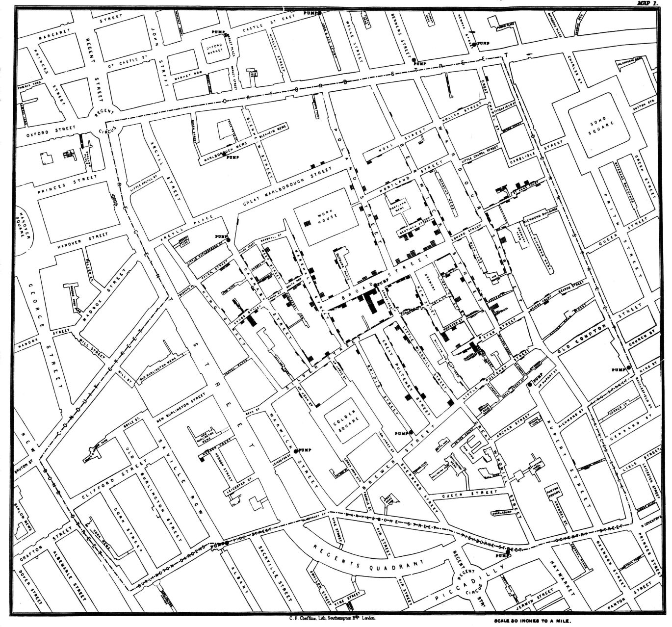
It is generally accepted that in the XVI century Martin Waldseemuller created the first map of the world, and since then cartographers were mostly occupied by making it more accurate. During the following two centuries many countries established national geographic societies and started developing thematic maps − that means that map were not be used purely for navigational purposes, but displayed qualitative, quantitative or temporal information about a certain region.
(Map displaying cholera spread in London 1840, published by John Snow in 1854, source)
From this viewpoint, there is really not much work left for cartographers in 2016. Administrative boundaries and digital elevation models are available from the open sources (e.g., here’s a list), navigational data can be downloaded from OpenStreetMap, many other data are also available online.
Just few years ago one needed the ability to have been able to write code in order to publish a map online. Today the scripts are completely built in, and you won’t see a string of code while uploading your map to, for example, ArcGIS Online.

Source
New Cartography
Nowadays, the focus of cartographers’ work has shifted to design and ability to tell a story.
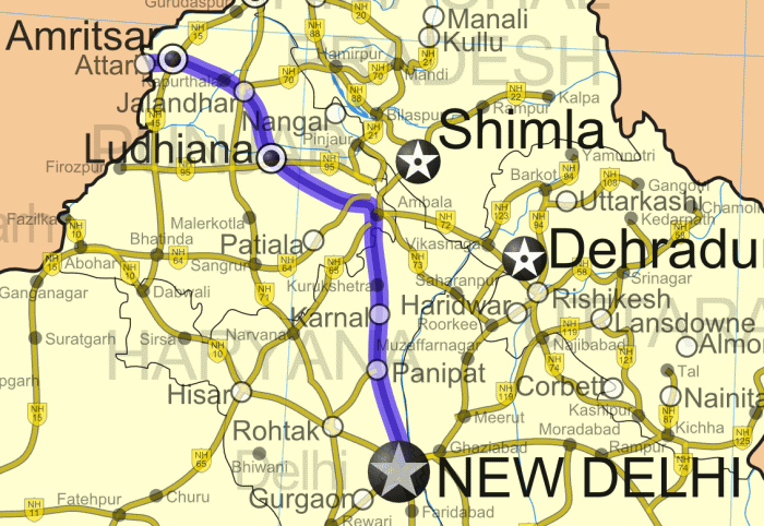
When trying to remember the last map that you have used, many of you will remember (1) GPS navigation you use and (2) map that someone gave you: just a screenshot from Google Maps/OSM/Here with a route from a metro station to the destination point.
Strangely enough, as many people regularly see the maps mentioned above, they are sure that most of the maps in this world actually are like this. In cognitive science it is called mere exposure effect: people tend to like things that they are familiar with, or at least that they have seen several times. These are not very good news for cartographers, though, as further on people may like maps with mediocre design even more, and strive for maps with good design even less. And that means: less jobs for cartographers.
But there are also good news: thanks to automation and general simplification of map creation process you have more time to devote to map design! Or, alternatively, you can make more maps with good design. Below you can find a few advices on creating the map you want.
Annoyance is a sign that it’s time to change something
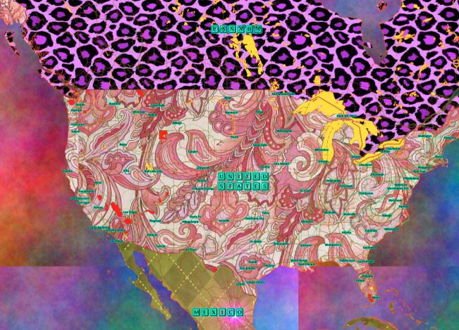
If you want to create a map that will confuse and annoy your target audience, please follow advices below:
1. Label ALL the objects on the map.
If your extent includes many objects of different scale, then by labeling all of them you can draw more attention to the map: your clients will take a long look at it, trying to find the label they need.
2. Not all the maps need a title
Why bother to invent a name for your map, if it is already clear what it depicts? And if some of future map users will not be able to understand the context, it is their own problem.
3. Don’t think about the map topic
What’s the difference if it is a map of agricultural land use, or a map of mean household income distribution in various districts of the city? Just pick your favourite color for symbology, users will enjoy it! And the meaning of each color they can check from the legend.
4. For quantitative symbology classes, don’t mention measurement units
The most important thing is to have enough symbology classes. Map users can easily guess the measurement units themselves, whether they are kilometers or miles, kilos or pounds, and what criterion they are normalized by.
5. Don’t think about target audience
What’s the difference who will use the map? Be it geology engineers, entertainment park visitors, or possibly people with vision impairments? It is better to do as you like, and others will manage themselves.
6. Be afraid of critics
If you will show your map to someone before publishing it, they can put bad eye on it. Or at least, they will criticize it. Especially, if you will show your map to a friend that knows few things about cartography, or who may be a part of your target audience. They may tell you that they don’t understand something, and then you will need to correct it. Hrrrrr. Too much stress.

Source
Create → get feedback → improve → repeat
In case you are interested to know how to create understandable and informative maps, you may want to think about following points:
1. One map tells one story
Each map has a function of delivering certain information: be it spatial trend, density of distribution, location of natural or anthropogenic objects and so on. Before creating a map it is good to reflect for a moment whether you yourself understand the story you are trying to tell with the map to the end user. Once you have figured it out, choose the color scheme, symbols and labels respectively.
If you will try to visualise ALL the information you have about given extent at once, chances are that you will just confuse the user. Try to focus on interpreting data one way at a time.
2. Keep it clean
Do you need names of city’s administrative areas on the maps of national parks of Kharkiv region? Do you need names of national parks on the map that’s picturing density of transportation flows in city? Some of background data are needed for spatial orientation, but try to keep only the necessary on your map: those parts that turn your data into information and, further, into spatial intelligence.
3. Put your accents
What data on the map are most important? And now, what is the data that stands out at the first glance? Double check, it should be the same data. You may need to make polygon fill semitransparent, reduce size or change color of labels, or to change the symbol size.
4. Choose appropriate size and color of text
What will be the print/display size of your map? Knowing that, you can choose most suitable text size and decide which map elements should be labeled and which ones shouldn’t. If there is a possibility that map will be used by people with visual impairments, try to keep text larger and its color more contrasting.
5. Get feedback
Show your work to a colleague or friend, and ask them to give you feedback. If you are sensitive toward criticism, or if you know your friend to be very demanding − just ask them to tell you what they like about you map, and what can be improved there. Sometimes it’s good to remind of golden rule of feedback: talking not only about weak sides, but also pointing out the strong sides.
6. Analyze the work of others
This is a very important exercise that can significantly speed up your learning process and facilitate forming your cartographic taste. Now, next time you see a map, list its strong and weak points. Are map colors related to map theme? Do you generally understand what the map is trying to tell you, without looking into the legend? Does it have a title, a scale bar, description, data sources, projection, author name? The further, the more questions you can ask about maps, and the more details you can take into account when doing your own work.
Do you have tips or secrets of good map design? Go on and share them in the comments!
And meanwhile, we are preparing another article about map design: next time we will share best practices from a producer!


