
Modern software for satellite image processing offers its users a wide range of supervised classification algorithms (more detail can be found here). It yields powerful capabilities for automation of the image interpretation process. In return for that, a user should make training areas of high quality. It is this quality what defines the accuracy of the supervised classification.
Theory
Many users have a natural wish to evaluate the quality of training areas they create. Of course, it is the quality of the classification result what indicates the quality of the training areas. But it is better to carry out an inspection before the classification is performed. Three methods are most commonly used to solve this task:
visual analysis of the brightness histograms of training areas,
visual analysis of training areas’ location in the n-Dimension scatter plot,
quantitative evaluation of spectral separability.
Shapes and relative positions of brightness histograms are examined during their analysis. For quality training areas, typically brightness distribution resembles a bell curve. And multi-modal distribution with several peaks on the histogram indicates that a training area corresponds to several different object classes at once.
It is preferable for histograms of different training areas not to overlap. If overlapping is observed, then training areas are not ‘pure’ enough. Probably they contain pixels from another object class.
Histogram analysis has a major drawback. For every spectral band of an image histograms have to be compared individually. And the more bands we have, the more comparisons need to be made. Hence a need arises in a method that allows comparing training areas’ brightness in multiple bands simultaneously. This method is analysis of n-Dimensional scatter plot (or spectral feature space).
By analyzing the multi-dimensional spectral features space it is necessary to pay attention to the relative position of data clouds (pixel groups). The further they are displaced, the more reliable is the differentiation of their corresponding objects after the classification. If they do overlap, then there can be problems with classes’ differentiation. And the more the data clouds overlap, the higher is the probability of errors during classification.
The first two methods of training areas quality assessment are graphical methods. Thereby they are not devoid of subjectiveness. An alternative for them are the qualitative methods of assessment of objects’ spectral separability on satellite imagery. They are based upon calculation of various indicators characterizing classes’ differentiation reliability.
Practice
We will now have a look at how training areas quality assessment methods are implemented in ENVI. ENVI (Environment for Visualizing Images) is a professional software for processing various kinds of satellite images. It is capable of performing the full work cycle, from the simplest operations to advanced processing. ENVI allows to analyze panchromatic, multispectral, hyperspectral, radar images, and to work with digital elevation models. Advantages of this program are integration with popular GIS software as ArcGIS and possibility to write own extensions in IDL programming language. ENVI’s closest competitors are ERDAS Imagine and PCI Geomatics.
As an example we will have a look at the simplest case where we research two types of surface from a satellite image. The first surface type is Chernozem soil, and the second type is gray forest soil (Alfisols is their analogue in the US soil classification). Of course, here we speak only of fields with no crop where the soil is bare and available for remote observation. Although soil covered with vegetation can be studied with satellite imagery, but only indirectly.
We need to create a designated training area for each soil type. And we need to have them with high enough quality. So, during a supervised classification a program must determine classes that correspond to selected soils. And it must do it with minimum errors.
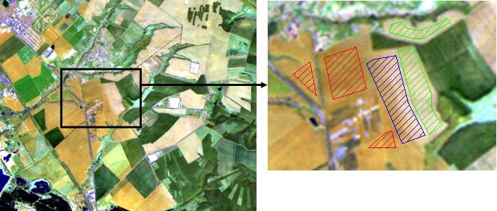
To solve our task we will use a multispectral satellite image made by Landsat 5 TM (frame number (path/row) 177/025). Image was captured on May 6, 2007. At this time of the year, a considerable part of fields is not yet covered with vegetation, and we can observe the soils we are interested in in the image. For scene rendering (fig. 1) we used a band combination 7:5:3. In this combination Chernozem is rendered yellow-brown with a touch of caramel, and gray forest soil is ash gray.
Figure 1 shows a fragment of this scene covering the territory to the east of Belgorod Reservoir, between the settlements of Razumnoe and Maslova Pristan’ (Belgorod Oblast). The reader can easily find this territory even without knowing the coordinates (with the settlements mentioned). Besides, being close to relatively large settlements we have a continuous area of arable land almost not interrupted by anything (such territories are convenient for illustration of tasks relating to soil studies). In this area Chernozems neighbor the gray forest soils area and their boundary can be easily seen in the image. The first ones are in the western part of the scene, the latter ones – in the eastern part. A black rectangle in figure 1 highlights a field where a boundary between two soil types can be distinctively seen.
Figure 1. Satellite scene fragment (left) and regions of interest marked on it (right)
Three training areas (regions of interest, ROIs) are marked on the image (fig. 1, on the right). Red dashing marks a ROI on the field with Chernozem. Green dshing marks a ROI on the field with gray forest soil. These are the examples of quality training areas which strictly correspond to a single object (surface). ROI shown with blue dashing is an example of the bad training area. It includes two types of soil simultaneously. Let’s try, with the help of various methods, to prove high quality of ‘green’ and ‘red’ training area and poor quality of the ‘blue’ training area.
Training areas’ histograms analysis
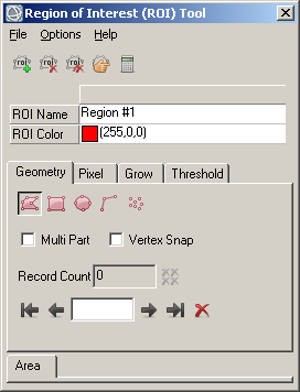
Suppose, we have a satellite image loaded in ENVI. Three regions of interest are marked in it (in ENVI they are used as training areas). And the Region of Interest (ROI) Tool window (fig. 2) is open at the moment. Then we need to perform the following operations in order to view a histogram of a single ROI.
① In the Layer Manager section we select the ROI we are interested in. In the example given below, ‘red’ ROI created for Chernozem is selected.
Figure 2. Region of Interest Tool
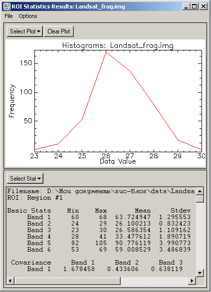
② In the Region of Interest (ROI) Tool we press the Compute Statistics button which looks like a calculator (fig. 2). ROI Statistics Results window appears. It contains statistical information on the ROI in the textual and graphical form. (fig. 3).
③ In the ROI Statistics Results window we press the Select Plot button and in the drop-down list we select a histogram for the band we are interested in. The result of this operation is shown in figure 3. Here we can see Chernozem brightness histogram in Landsat’s third band. Brightness appears to be distributed normally. There is only one peak. It indicates that ‘red’ ROI is of high quality.
Figure 3. Statistical information on the selected region of interest
Comparison of ROIs’ histograms
Having studied only the form of brightness histograms we cannot dispel all the doubts about training areas’ quality. Two areas may have brightness histograms of a very good, promising quality. But at the same time histograms can overlap. It happens when we trace out two training areas on the same object class. Therefore we need to review and compare histograms’ relative positions. In order to do that we perform the following operations:
① In Region of Interest (ROI) Tool we select Options – Compute Statistics from ROIs…
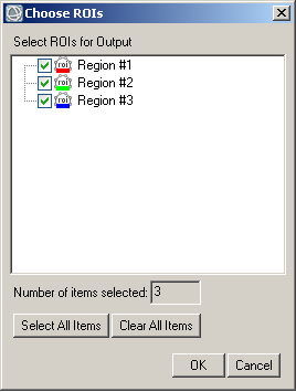
② Choose ROIs window appears (fig. 4). There we select the desired ROIs.
Figure 4. Choose ROIs dialog
③ An already familiar to us ROI Statistics Results window appears. But now it has another option – Stats for. Using this drop-down list we can select a ROI to view its statistics. Further on we repeat the same steps as in the previous example (see above, part 3).
Here we can see two alternative ways of performing the same operation. This is typical for ENVI. Many image processing procedures can be performed in two or even three alternative ways in this software.
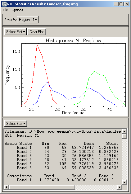
④ And now, moving to diagram comparison. In the ROI Statistics Results window we press the Select Plot button. The drop-down list looks similar to the previous case but it contains new commands. We select the Histogram for all ROIs command and then select the required band.
Figure 5. Viewing multiple histograms on a single chart
In figure 5 we can see brightness histograms of the Landsat’s third band for all three ROIs. Histograms of the high-quality ROIs (‘red’ and ‘green’) do not overlap. And ‘blue’ ROI’s histogram overlaps two other histograms. Apart from that, there are two peaks on the blue histogram. It happened because blue ROI captures pixels from both interpreted soils – the Chernozem and the gray forest soil. So, it will be better not to use the ‘blue’ ROI for interpretation of two soils under study. This ROI will be a bad training area for supervised classification.
Visual analysis of ROIs’ location in the n-Dimension scatter plot
① In Region of Interest (ROI) Tool’s menu we select Options – Send ROIs to n-D Visualiser
② Choose ROIs window appears (fig. 4). There we select required regions of interest.
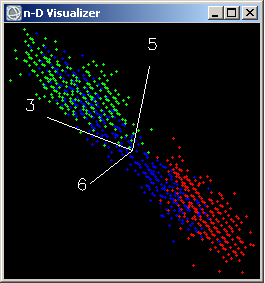
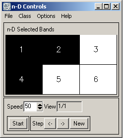
③ Two windows will appear (fig. 6). In the n-D Controls window we have to select bands for visualization by clicking on the corresponding squares. In the example given in figure 6, Landsat bands 3, 5 and 7 (no. 6 in the picture) are selected.
In n-D Visualizer window relative position of our ROIs’ data clouds is displayed. Axes of the scatter plot (a three-dimensional space in our case) are shown with white lines. These axes correspond to image bands selected in the n-D Controls window.
Figure 6. Visualization of the n-Dimension space of spectral features in ENVI
In figure 6 (left side) we can see that clouds of values of ‘red’ and ‘green’ ROIs do not overlap. And ‘blue’ ROI overlaps with two other ROIs. Thus we corroborate a conclusion, drawn by the comparison of brightness histograms, about the poor quality of the ‘blue’ ROI.
Quantitative evaluation of the spectral separability
In Region of Interest (ROI) Tool’s menu we select Options – Send ROIs to n-D Visualiser…
Choose ROIs window appears (fig. 4). There we check the wanted regions of interest.
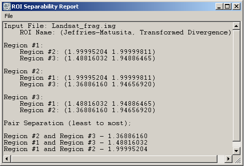
ROI Separability Report window containing spectral separability information pops up (fig. 7).
Two measures of spectral separability are calculated in ENVI: Jeffries-Matusita distance and Transformed Divergence. Their values range from 0.0 to 2.0. For well separable ROIs values exceed 1.9. If separability value is lower than 1.0, then we are most likely to deal with ROIs marked on the same surface class.
Figure 7. ROI Separability Report
In this report (fig. 7) ‘red’ ROI (Chernozem) is identified as Region #1.
‘Green’ ROI (gray forest soil) is identified as Region #2.
‘Blue’ ROI is Region #3.
At the end of the report, ROIs’ pairs separability (Jeffries-Matusita distance) is listed from the least separable to the most separable. And here the result matches those we achieved with graphical methods.
‘Red’ and ‘green’ ROIs have significant spectral separability with each other but not with the ‘blue’ ROI.


Hello,
Thanks for great article. What are units on X-axis and on Y-Axis… I am little bit confused what is Data value… Is it digital number? Thx!!!
Yes, in this article values in digital numbers. In Fig. 3 and Fig. 5 X-axis — data values in digital numbers, Y-axis — number of pixels in pieces.
Instead of images with digital values, you can use images with reflectance or radiance values. Interpretation of separability (Fig. 7) will remain the same.