The analysis of the multidimensional spectral feature space is a very useful tool for decoding multiband satellite images. Its use helps to choose the optimal classification algorithm. You can also directly classify objects in a multidimensional spectral feature space, and then transfer them to two-dimensional geographic space of the space image. These two areas of use are related to the processing of snapshots of the same date. But the spectral feature space can also be used to process multiple images taken at different dates. This is one of the ways to automate the change detection in spatial data. We will analyze it in this post using the simplest example with two images taken at different time.
Theory
To compare the pixel values of the same band from two different dates, you need to create a two-dimensional spectral plot with the axes corresponding to the dates. It will be logical if the X-axis is the initial date, and the Y-axis is the final date. Let’s explain this logic a little. The state of the area at the end is the result of transformations that have taken place for the initial state. Mathematically speaking, the final state (Y) is a function of the initial state (X): Y = f (X). And when we display the function graph, we put Y on the vertical axis and X on the horizontal.
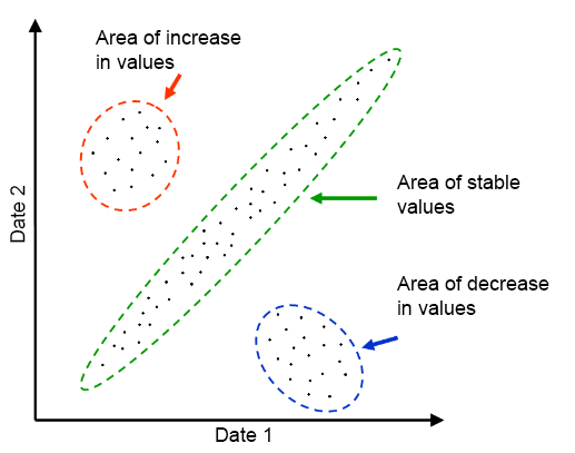
All possible relationships between initial and final values in the two-dimensional feature space look like scattered points. Therefore, such a graph is also called a scatter plot. The schematic example is shown in Figure 1.
Fig. 1. Scatter plot
Values that vary only slightly between two dates create a cloud of values with a narrow and elongated shape on the chart (it is encircled in green in Fig. 1). This cloud is drawn along a line that can be described by the formula Y = kX + b. The coefficients k and b represent respectively the angle of the slope of the line and its displacement vertically. Ideally, when there are no changes in the area k = 1 and b = 0. In this case, the line goes through the origin and has a 45° inclination angle. That is, for the pixels with the same coordinates in the image the value of spectral brightness for both dates is the same.
There are cases when there is no change on the ground, but there are changes in the brightness of the pixels. This is due to differences in surveying conditions, or due to the fact that they compare data from various satellite sensors. If these changes in pixel brightness are the same for the whole image, they will not interfere with the automated search for area changes. Pixels that have not been modified will create a linear elongated cloud on a scatter plot. But in that case, it will have an angle of inclination other than 45º.
The clouds of points corresponding to changes in the terrain are located on the scatter plot on both sides of the diagonal. These clouds usually have a rounded shape. Thus, it is quite easy to visually distinguish pixels that have undergone changes in the plot. But to create a change map, we need to identify these pixels in the geographic space. We will analyze how to do this in the practical part of our post.
Practice
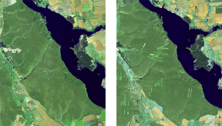
We will use an example from a previous post to examine the practical aspects of finding the changes. Our task is to use the Landsat satellite images to find deforestation, the area is located on the right bank of the Pechenizke reservoir. We will analyze two images from May 7, 1996, and May 6, 2007. To make the scatter plots more clear and to facilitate interpretation, we will only use forest area in the analysis.
Fig. 2. Study area. On the left – image from May 7, 1996, to the right -image from May 6, 2007
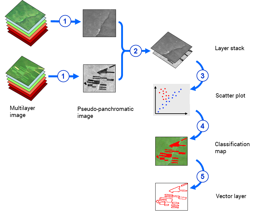
Image processing consists of five steps (also shown in Figure 3):
1) Creating a pseudo panchromatic image from each image by averaging pixels from different bands
2) Combining two different-time images into a single, multi-layered raster (bitmap layout)
3) Creating a scatter plot and selecting on it a class corresponding to changes in the area
4) Exporting of the class, which was isolated on the scatter plot, into the processing area
5) Exporting the processing area into the vector layer.
The first and fifth stages have already been described in the previous post. So now we will look at them in detail.
Fig. 3. Data processing stages
Layer stacking
A) ENVI lets you create scatter plots only for raster layers that belong to one file. In fact, this is only true for the modern versions of the software. For versions prior to 5.0, it was possible to use rasters from separate files, they only had to have the same size in pixels and display coordinates.
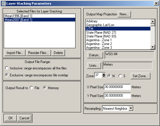
While processing multitemporal images at first we have at least two rasters. We have created two separate difference images from the initial data. Next, we need to combine them in one multilayer raster (stack). To do this we need to pick Raster Manager → Layer Stacking in ENVI toolbox. A window with settings will appear (fig. 4).
B) Using the Import File… button we need to choose rasters for the stack. After pressing the button a window will pop-up where you can select the files.
C) Select the mode of saving the results to temporary memory or a file.
D) Other settings can be left as default.
Fig. 4. Setting up layer stacking
Work with the scatter plot
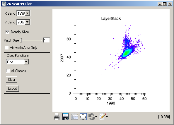
A) To create a scatter plot select Display → 2D Scatter Plot in the main menu of ENVI. A window will appear containing the diagram (2D Scatter Plot). On the right-hand side, you will see the diagram, on the left – the settings (fig. 5).
Fig 5. 2D scatter plot
B) First of all, set up the axes. The drop-down lists of X Band and Y Band let you choose the data layers for display. In our example (fig. 5), the X axis contains 1996 data, the Y – 2007 data.
C) After setting up the axes, you need to select the extent for diagram display. There are two options. It is possible to use the whole image or the extent that is displayed in ENVI. By checking the box near Viewable Area Only, we will pick the second option, if not – the first.
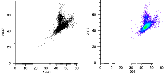
D) Each point of the diagram represents a correlation of values between two dates. Some correlations may be present for many pixels. Other correlations, on the contrary, are rarely present. You can visualize the differences (the density distribution of values) if the number of pixels is displayed by color in the diagram. 2D Scatter Plot does not display this density by default. All the dots on the plot are shown in black. If you tick the Density Slice box, the dots will be multicolored. The high density is shown in green. As the density goes down, the color changes to cyan, then to blue and then to violet.
Fig. 6. Normal scatter plot (left) and color-coded density scatter plot
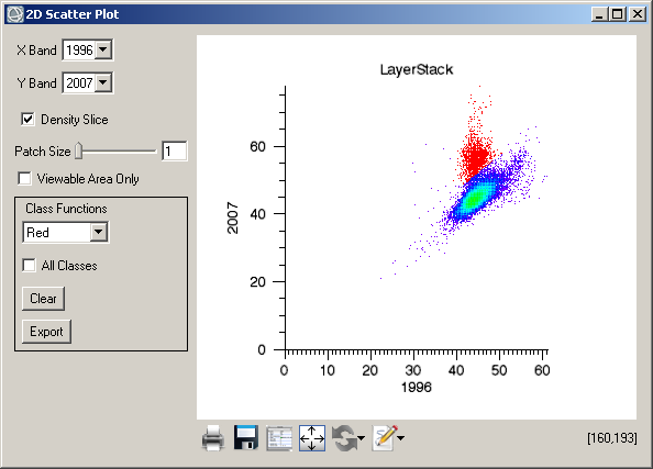
E) Now we will look at Class Functions The setting options are in the black box in the 2D Scatter Plot window. To select a class in a two-dimensional space, you must first select the color in the drop-down list. Each class that we isolate must have its own color. The default color is red.
Next, select a part of the cloud of values that corresponds to the pixels with the changes with the left mouse button. To complete this process, you must right-click.
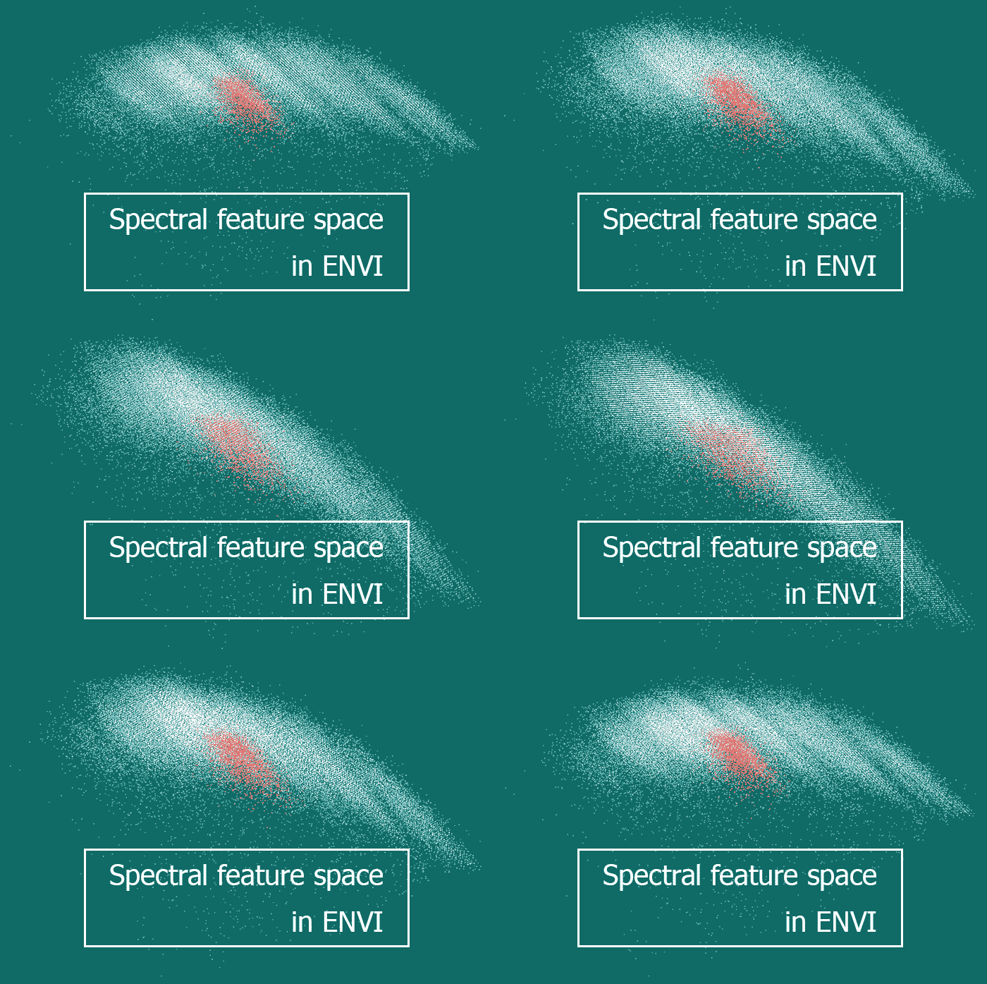
The result is shown in Figure 7. If needed the selection can be removed by pressing the Clear button. After selecting a change class, you can export it to the processing area. This is done using the Export button. It allows us to identify the locations of the points that we have selected in the geographic space.
Fig. 7. 2D scatter plot with change classes highlighted in red
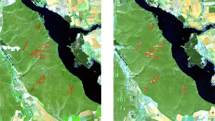
Work with the processing area and export to the vector layer
When we have the processing area, we can overlay it on the image. An example of this is shown in Figure 8, where the boundaries of the deforestation are outlined by a red line.
Fig. 8. Deforestation detected shown in the form of processing area (shown in red), overlayed on the satellite image. To the left is the 1996 image, to the right is the 2007 image
To further use the processing results, for example, to create a change map using GIS-applications, you can export the processing area to a vector layer. For this, you need to select File → Export → Export to Shapefile … menu in the processing window. Also, the results can be exported into GIS in raster format. For this, the processing area must be converted into a classification map. This procedure is performed by selecting Region of Interest → Classification Image from ROIs.



Thank you, I saw a lot of websites but this one has something extra in it. This Blog gives me a lot of information. It is inspiring article to increase my knowledge.
http://sindhuraprojects.com/open-plots-for-sale-in-tukkuguda/