Idea
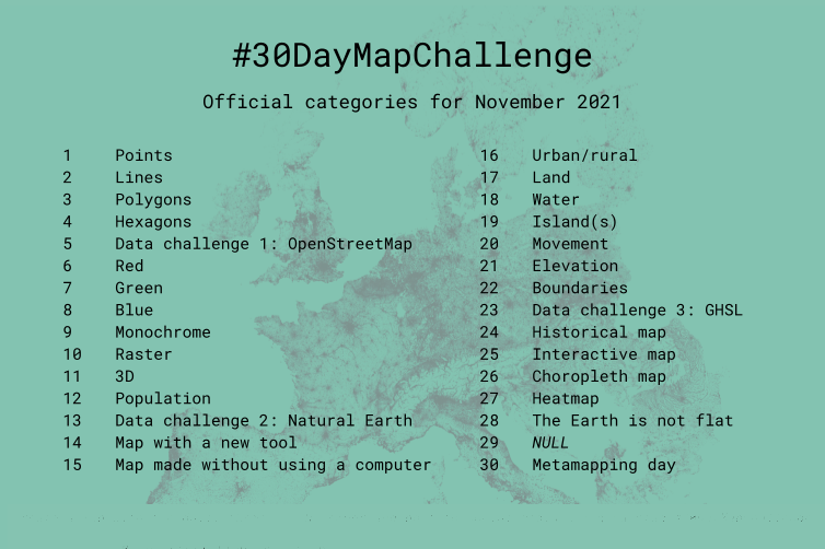
30DayMapChallenge has begun on Twitter by Finnish geographer Topi Tjukanov. Challenge rules are very simple. Throughout November participants publish maps with the hash-tag #30DayMapChallenge. Each day has its own topic. For instance, the topic for the 1st of November was Points and on November 25th everyone should publish some interactive map.
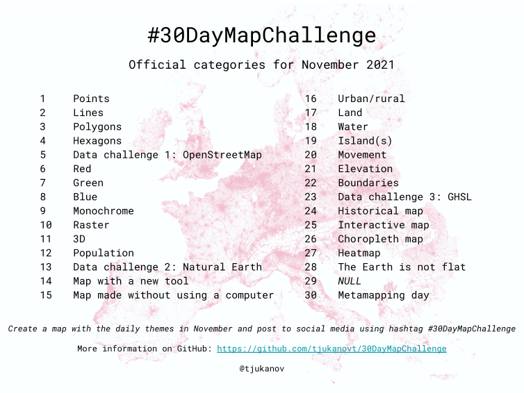
Pic 1. Map topics of 30DayMapChallenge 2021
There are no other restrictions in the challenge rules. No need to publish a map every day or draft a map exactly on the day of publication. There are no restrictions on mapping tools, so free or proprietary GIS or graphic editors or even pen, paint, or sand will work. It is allowed to use any data sources (of course with respect to authorship and copyright). Especially emphasized that challenge is not a competition and it’s about creativity, openness, and the joy of beautiful maps and cartography.
There were more than 1200 challenge participants from around 90 countries. Around 9000 maps were published. They can be accessed through the hash-tag #30DayMapChallenge, and if you want to see maps with the biggest number of likes you can check the challenge website.
As far as I know, Ukraine was represented by 3 participants including myself (but I’m happy to be wrong here so please add other participants in comments). The other two participants are one of the top cartographers in Ukraine (and maybe even worldwide) Fedir Gontsa and GIS-enthusiast and QGIS promoter Andriy Yaremenko.
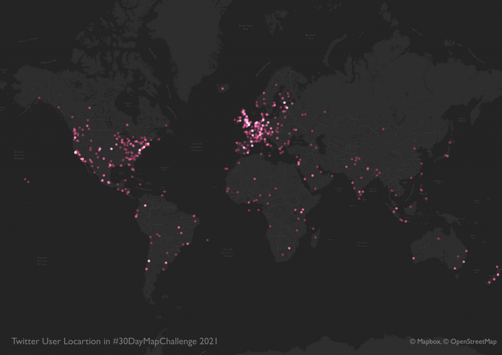
Pic 2 Locations of challenge participants
Participation
For the first two years, I was observing the challenge but did not participate in it using usual explanations like “I have no time” or “Anyways I can’t do as good as other participants”. But this year I overcame myself and decided to try my skills. In addition to primary challenge rules I added several of my own:
- Do not prepare maps in advance, and make each map in one day. Partially it made my task more complicated but in such a way there was no temptation to publish the already created map. Because that will turn the challenge into a search for maps that suit today’s topic.
- Do not miss any day and prepare 30 maps. Though there was no such rule in challenge rules I think it will make it more interesting and challenge will become some kind of test for the professional level. It’s easy to make 1-2-5 maps choosing familiar topics and working with well-known data. And it’s a completely different story to make a map on a topic that you never worked with or do not like.
- Map topics and extent should cover Ukraine. Actually, the majority of challenge participants mapped the country where they were born or living now. And that’s not a surprise considering that it’s easier to work with a familiar area. So from one side when I chose Ukraine it made the challenge easier but on another hand made it more complicated because such a choice significantly limited available data sources (especially for vector data).
- The primary mapping tool should be ArcGIS Pro. For more than 2 years I’ve been using ArcGIS Pro as my main working tool (my experience with migration to ArcGIS Pro is available here). But I was interested in how ArcGIS Pro will handle the preparation of 30 different maps with completely different themes. An additional condition becomes the rule that all maps and input data should be stored within one project file and geodatabase.
Map format should be 10×10 cm, they should have a similar layout and style. This rule simplified the map preparation process because there was no need to look for the best page size, font, and layout style. But of course, considering some topics this rule was broken several times.
Process
Probably the most challenging part in the creation of each map was searching for an idea. For some topics, ideas were already formulated but that doesn’t mean that idea can’t change. For instance, for the “Islands” topic I planned to show a detailed topographic map of some river islands but end up with Minecraft-style Snake island map.
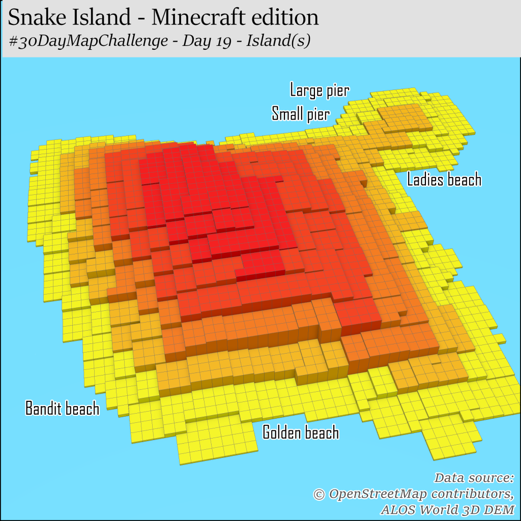
Pic 3 – Topic “Island(s)”
Oftenly ideas have to be changed due to lack or quality of the input data. In general I tried to choose data that I haven’t worked with. For instance, as an elevation data source, I chose not SRTM or GDEM but ALOS World 3D DEM. As a result, I was pleasantly surprised by the quality of this DEM and lack of visible artifacts. As the challenge continued I got familiar with the recently published land use\land cover dataset ESA World Cover and was persuaded that now it’s definitely the best data source about land use and land cover for Ukraine.
I didn’t avoid such usual data sources as OpenStreetMap, statistics from the State Statistics Service of Ukraine, and search for datasets on Open Data Portal. Sometimes I felt envious of other participants looking at various data sources that are available for their countries. Because at our national Data Portal there are less than 100 datasets in formats that are directly accessible with GIS. And even among those datasets some of them may consist of one point or instead of a data download page forward to the online-casino website.

Pic 4 “Powerful” one point dataset
Finding the idea, search and data preparation were the most complicated parts of the process. Purposely I didn’t spend too much time on the selection of visualization techniques, the definition of fonts and colors. Otherwise, I was risking to delay the mapping process and didn’t publish my map in time. Using this approach each map took around 1.5-2 evening hours. During the first days, it was hard to find a rhythm when after your main job you need to spend several hours on the challenge. But as it became a habit evening mapping didn’t appear to be a problem. One week in November I was on a business trip that forced me to make part of the maps in almost field environment and Intercity train.
Result
Final version of the maps I published on my Twitter and LinkedIn. And although the challenge was done primarily for myself, it was still interesting to watch the comments and likes from other users. The most active reaction was for the map published on the 13-t day and that showed drawbacks of Natural Earth data. And even if such reaction is totally understandable it was still a bit sad that this frankly speaking visually bad map created in 20 minutes got more appreciation compared to other maps that took much more effort.
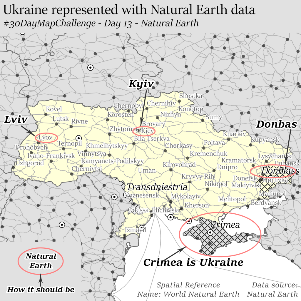
Pic 5 Map that got the highest appreciation from Twitter users
From a technical point of view, the most difficult map was the map of the dominant types of land use in Vinnytsia region made on the 4th day of the challenge. For this map, I made a mosaic of ESA World Cover rasters, calculated the area of each land use category within the hexagon grid, and transferred the name of a column with a maximum value into a separate variable. As a result, I got a very generalized version of land use \ land cover raster that shows significant domination of agricultural lands across the entire oblast.
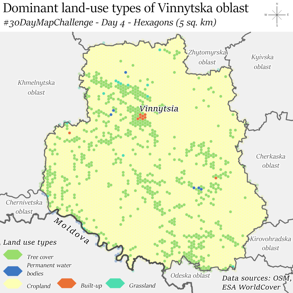
Pic 6 Dominant land-use types of Vinnytska oblast
Visually, my favorite was the map of the population of Dnipropetrovsk region according to GHSL. Thanks to the use of a grid of triangles, it was possible to achieve a visual similarity to the pattern of a vyshyvanka while preserving information about the population density of the region.
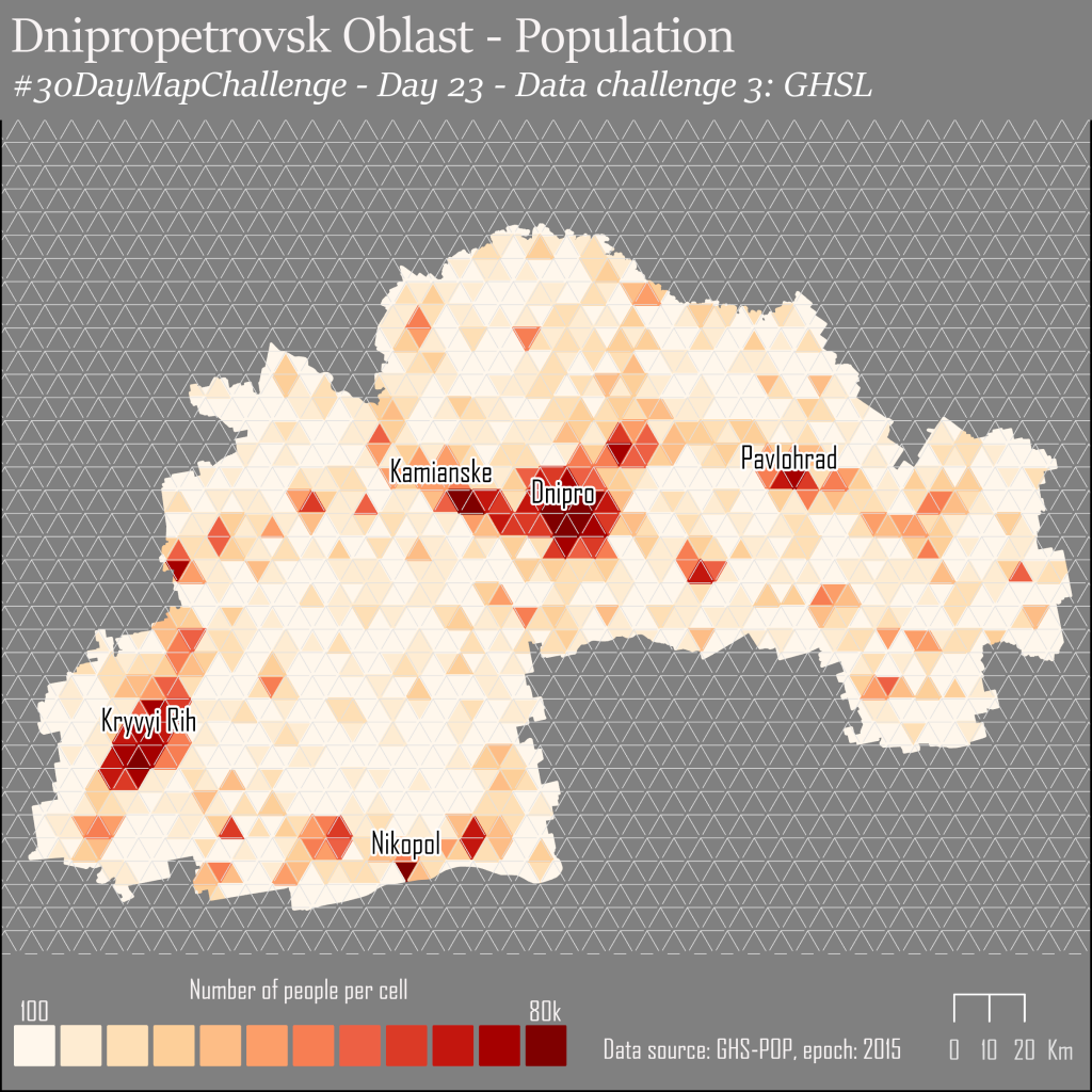
Pic 7 Population of Dnipropetrovsk oblast accordingly to GHSL data
In general, the challenge provided a good opportunity to expand my own horizons. For these 30 days, I processed data about dominant causes of death in 2021, read about exclusive economic zones, looked through the history of street renaming in Chernivtsi, and got familiar with the condition and species of trees in Dubno. Of course, not all of this information was mapped but it was pleasant that the number of likes does not directly depend on the variety of colors. For example, a visually moderate map of ghost villages compiled according to Wikipedia received 84 likes, which was almost a record (if not Natural Earth data map which I mentioned above).
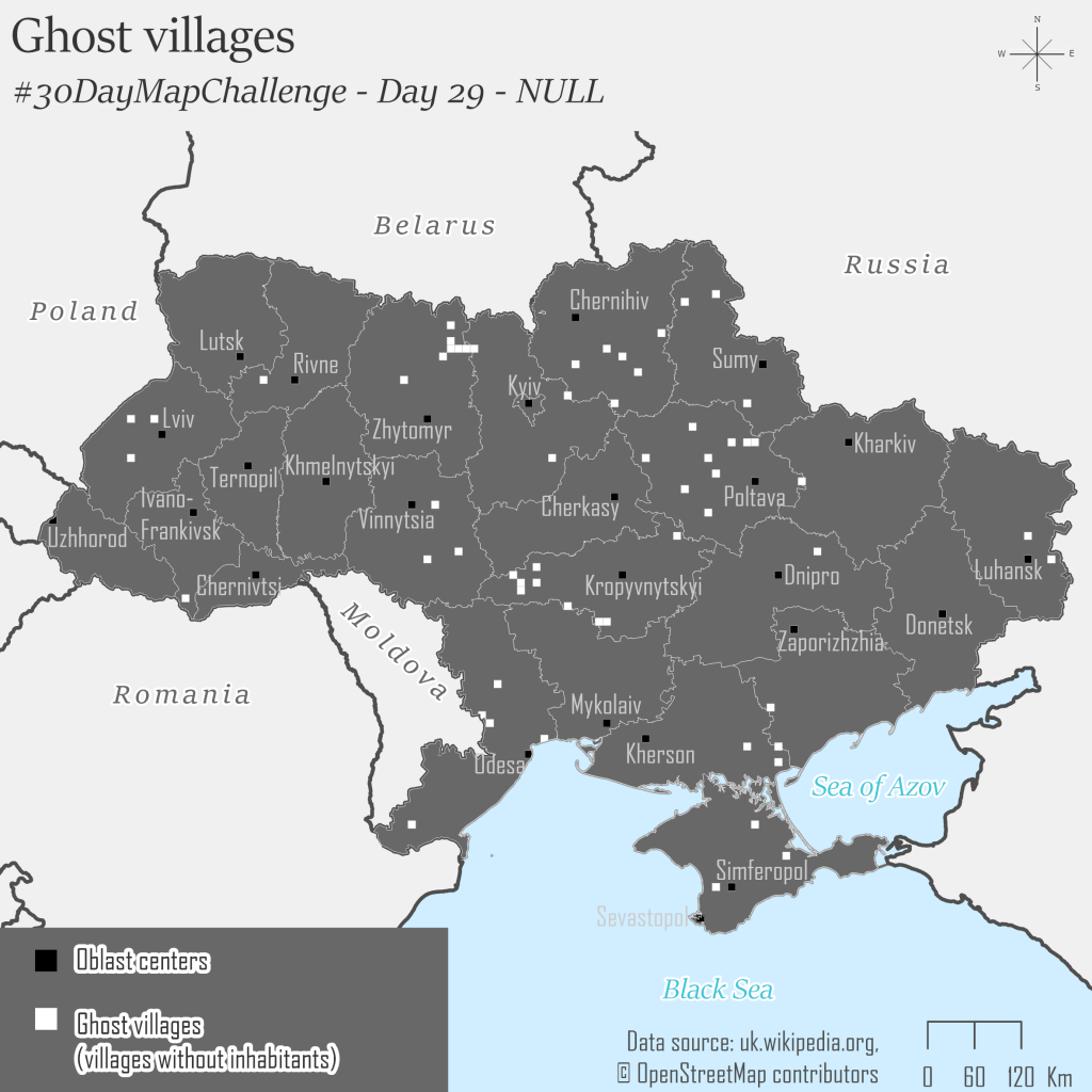
Pic 8 Ghost villages according to Wikipedia
Conclusion
Each year 30DayMapChallenge expands more widely. Today it became one of the biggest events for the cartographic community, because what other conference lasts for 30 days and has more than 1000 active participants?! So if you haven’t followed the challenge this year but like maps, you should look at them on the project website. And even better, join the challenge next year, because this experience is definitely worth the time and effort.
Links
- Topi Tjukanov Twitter – https://twitter.com/tjukanov
- Challenge rules – https://github.com/tjukanovt/30DayMapChallenge#-code-of-conduct
- Challenge hashtag – https://twitter.com/hashtag/30DayMapChallenge?src=hashtag_click
- Challenge site – https://30daymapchallenge.com/2021/
- Website of Fedir Gontsa – https://fedir.gontsa.com/
- Blog of Andriy Yaremenko – https://medium.com/@andriyyaremenko
- ALOS World 3D DEM – https://www.eorc.jaxa.jp/ALOS/en/index_e.htm
- ESA World COVER – https://viewer.esa-worldcover.org/
- Open Street Map – https://www.openstreetmap.org/
- State Statistics Service of Ukraine – http://www.ukrstat.gov.ua/
- Open Data Portal – https://data.gov.ua/
- Vector geospatial data obtained as a result of aerial photography of the village of Pulyny – https://data.gov.ua/dataset/24eac8c9-71f0-4504-bceb-3ebfe6b196c2
- Adresniy reestr m. Chernivtsi 23/07/2021 – https://data.gov.ua/dataset/21973729950333683006086915761551597/resource/c203f909-6492-4554-af36-01e7a4663a28
- Yaroslav Smirnov – Twitter- https://twitter.com/jaroslav_sm
- Yaroslav Smirnov – LinkedIn – https://www.linkedin.com/in/yaroslav-smirnov/
- Natural Earth data – https://www.naturalearthdata.com/
- GHSL data – https://ghsl.jrc.ec.europa.eu/download.php?ds=pop
- Depopulated settlements of Ukraine – https://uk.wikipedia.org/wiki/Категорія:Знелюднілі_населені_пункти_України


