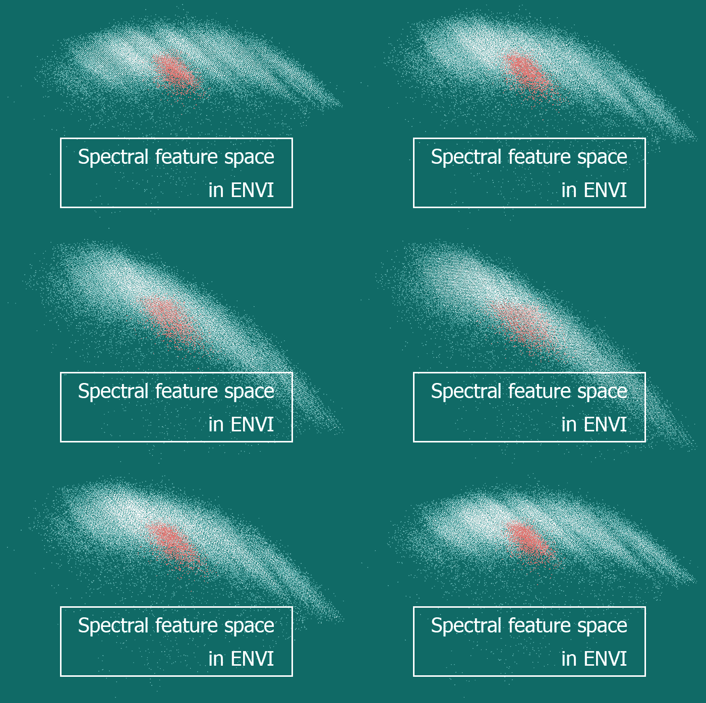
There are different ways to illustrate objects’ spectral brightness variation when moving between different spectral ranges. If it has to be shown for a single pixel of an image or generalized for a group of pixels, then spectral brightness curves are used. And what has to be done when one wishes to display spectral characteristics of every pixel of the satellite image? In this case we will make use of the multidimensional scatter plot.
THEORY
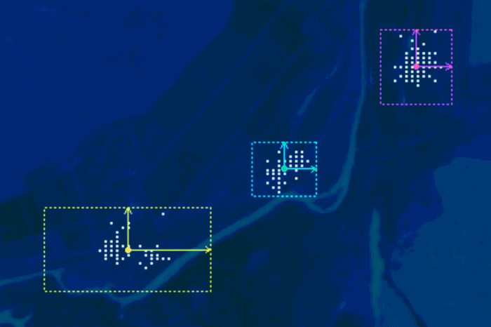
An n-Dimensional scatter plot is a graph which has spectral brightness values plotted on its axes. Every axis refers to an individual spectral range (image band). In the simplest case having two axes we get a 2-D scatter plot. If there are more than two axes, the plot becomes volumetric (multidimensional). All the brightness combinations that exist in the image form a point cloud in this space. Each image pixel has a corresponding point in this cloud.
ENVI has a dedicated n-D Visualizer tool to work with the n-Dimensional spectral feature space. It can be used to solve various tasks. For example, choosing an optimal algorithm of the supervised classification and training areas’ quality assessment.
This article covers the usage of the n-D Visualizer for satellite images interpretation. Workflow of all the automated interpretation (classification) algorithms can be represented as the processing of the n-D scatter plot displayed as the data cloud. From this perspective, classification comes to division of the point cloud into separate classes. This is done with mathematical formulas that the classification process is based on. In case a user wants to distinguish classes manually using their own criteria, they can do that as well.
The practical part of our article covers image classification in ENVI using the n-D Visualizer tool.
PRACTICE
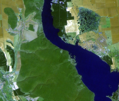
Let’s discuss the work with the n-Dimensional scatter plot by the example of the Landsat image interpretation. Image fragment (fig. 1) covers territory on the right and left banks of Pechenihy Reservoir. This territory has various surface types – water bodies, coniferous forests, deciduous forests, open soil etc. Pechenihy Reservoir is blue in the presented Landsat image (band combination 7:5:3). Deciduous woodland (Pechenihy Dacha) on the reservoir’s right bank is grassy-green. Coniferous forests that grow primarily on the reservoir’s left bank are dark-green (fig. 1).
Our goal is to create a map of water bodies’, and coniferous and deciduous woodlands’ distribution. In order to accomplish it we have to:
① create a scatter plot;
② inspecting the scatter plot, identify various earth surface types in the data cloud;
③ distinguish classes corresponding to various surface types on the
scatter plot;
④ export classes from the scatter plot to a 2-D cartographic image.
So, let’s view in detail the content of each of these four steps.
Figure 1. Landsat image fragment
Step I
Creating a scatter plot from the existing region of interest
To create an n-D scatter plot select: Spectral→ n-Dimensional Visualizer→ n-Dimensional Visualizer New Data.
In the next dialog (n-D Visualizer Input Data) choose an image a scatter plot will be created for. Next, a dialog box will appear where you have to select a ROI which the information on the specific pixels will be taken from (you have to create the ROI covering the proper part of the image in advance).
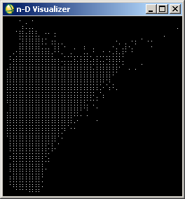
Two windows will appear: n-D Visualizer and n-D Controls. The first window (n-D Visualizer) is an n-Dimensional visualizer displaying a data cloud. The second window (n-D Controls) is used to adjust the data cloud display.
n-D Controls has a menu, n-D Selected Bands section and buttons for navigating the spectral feature space/scatter plot. At first, this plot will be empty in the n-D Visualizer. If we click the band numbers in the n-D Selected Bands section, data points will appear in the n-D Visualizer window. Its shape depends on the bands selected. In figure 2 these are bands 3, 4 and 5. In n-D Selected Bands section they have white background, and the rest of the bands that were not used have black background. It is clear, that in order to create a spectral feature space we need at least two bands. This way it will be a 2-D feature space. For a volumetric appearance, we need at least three bands.
 |
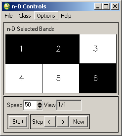 |
Figure 2. n-D Visualizer (left) and n-D Controls (right) windows
Step II
Navigating the scatter plot
Navigating the scatter plot in ENVI is just rotating the data cloud. There are two rotation modes: automatic and manual. To start an automatic rotation, press the Start button. To adjust rotation speed, enter a value in the Speed input line (the default value is 50).
If you want to display the axes of the n-D scatter plot, select Options → Show Axes. To manually rotate the data cloud select Options→3D: Drive Axes. Now you can spin the data cloud manually by clicking and dragging it.
When rotating the data cloud it is necessary to inspect it from all sides. By doing this, it is possible to see individual point clots corresponding to certain surface types.
But what are the surface types they correspond to?
ENVI has two ways of solving this question. Firstly, we can import spectral brightness curves (in ENVI they are stored in the spectral library format) and see where they appear. In the multidimensional space of spectral features, a spectral curve will transform into a separate point.
Secondly, we can directly view the spectral brightness curves for every point displayed in the n-D Visualizer. Every surface type has its own specific curve shape. They can be distinguished by their curve shape. Spectral brightness curves are also called spectral signatures (i.e., a signature similarly to a person’s individual signature).
Importing spectra into the scatter plot
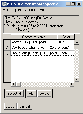
To import spectral signatures stored in the spectral library into the scatter plot, in the n-D Controls window select Options→Import Library Spectra… The n-D Visualizer Import Spectra dialog will appear (fig. 3). There go to the Import menu, choose the type of the spectral signatures source (spectral library, ROI, ASD-file etc.). Open individual spectral curves and they will appear in the n-D Visualizer Import Spectra dialog.
Figure 3. n-D Visualizer Import Spectra dialog
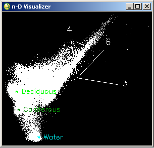
Press Apply in the n-D Visualizer Import Spectra dialog. After that, spectral signatures will appear in the n-D Visualizer window (fig. 4).
Figure 4. Spectral curves on the scatter plot
Once imported, a spectral brightness curve will be displayed as a color asteriks in the scatter plot. Names of the spectral signatures are displayed beside these asterisks. In figure 4, water bodies’ signature is displayed in cyan, coniferous forests’ signature is dark-green, and deciduous forests’ signature is light-green. The next figures (fig. 5-8) use the same color key.
Viewing a spectral signature
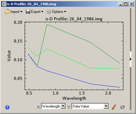
There is another way to identify surface types in the data cloud. It is the opposite of the previously discussed method. Choose Options→Z Profile… Then right-click any point. N-D Profile dialog will appear displaying spectral plots (fig. 5). At first, it will be empty. In order to display a spectral curve, it is necessary to click the point in the data cloud which you want to display the spectral curve for.
By default these curves are black. For distinguished classes, spectral signature’s color corresponds to the class color. For example, when you click the white point, a black plot is displayed; and when you click a colored point, the plot has the same color as that point.
Figure 5. Spectral plots for water bodies, deciduous and coniferous forests
In figure 5, you can see a typical spectral responces of water bodies (blue plot), coniferous (dark-green) and deciduous (bright-green) forests. For water bodies the typical spectral signature’s shape has a gradual brightness decline when transiting from blue spectral range to infrared spectral range. For forests (and for vegetation in general) spectral brightness curve has a dip in the red spectral range and a peak in the infrared. For coniferous forests the difference between these spectral ranges is greater than for deciduous forests.
Step III
Defining classes in the scatter plot
Once you have identified surface types in the data cloud, you can proceed to the classes determination. To do this, in the n-D Controls dialog menu select a Class section and choose the class color. Then in the n-D Visualizer window encircle a part of the data cloud like the one shown in the figure 6 (highlight the desired pixels on the n-D Visualizer by left-clicking to set vertices, and right-clicking to close the polygon).
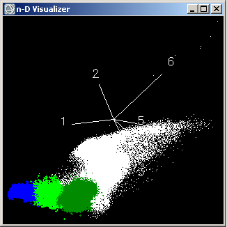
Figure 6. Defining classes in the n-D scatter plot
Step IV
Exporting classes from the scatter plot
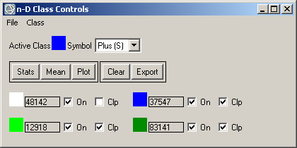
Classes defined in the n-D scatter plot can be exported to the region of interest (ROI). To do this, in n-D Controls window choose Options→Export Class or Options→Export All. The first command exports a currently active class. The second command exports all classes. To find out which class is currently active or to activate a different class select Options→Class Controls… n-D Class Controls dialog will appear (fig. 7).
Figure 7. n-D Class Controls dialog
The upper part of the n-D Class Controls shows the currently active class. The lower part of the dialog has a list of all the classes. To activate any class, press a corresponding colored square in the classes list. Pay attention to the Export button in the n-D Class Controls dialog. It can also be used to export the currently active class to the ROI.
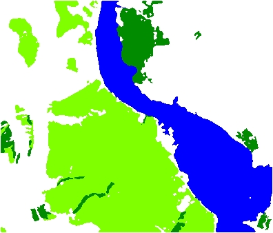
Exported classes won’t be displayed in the table of contents. But they exist in the program memory, so we have to create a classification image from them. To do this, select Regions of Interest → Classification Image from ROIs. As a result, an image similar to the one shown in the figure 8 will be generated.
Figure 8. Classified image
In general outline, figure 8 correctly represents the geography of the three types of surface (water bodies, coniferous and deciduous forests). Some areas were misinterpreted.
We will discuss how to assess the classification accuracy in the next post.



very nicely explained. thanks alot sir. could u please make an article on MNF and how that used in PPI. expecting an article on this